
project overview
Auditing the Booking Experience
Cineplex's movie booking experience had known usability friction, but no formal research to pinpoint where and why users were failing. As part of a team of three, I conducted a remote usability audit to identify the highest-impact problems and propose targeted redesign recommendations.
my role
UX Researcher
Responsibilities
I collaborated in designing our testing protocol, set up surveys and remote tests using Google Forms and UsabilityHub, and personally moderated 2 of the 5 user sessions. After analyzing the data with my team, We proposed redesign recommendation that directly address the friction points we discovered, which you'll see in the redesign sections below.
RESEARCH APPROACH
How We Tested
We recruited 5 participants (ages 18-35) and conducted remote usability testing via Zoom. Each session combined quantitative and qualitative methods to capture both behavioural data and user sentiment.
Tools
Zoom
Google Forms
Usability Hub
Canva
Adobe XD
The Testing Flow
5-Second Test — Assessed first impressions and information hierarchy
Pre-Test Survey — Gathered context on movie-watching habits and preferences
First Click Test — Identified whether users could find filtering options intuitively
Preference Test — Compared two design approaches for visual appeal
Task Scenarios — Observed users completing 4 real-world tasks with think-aloud protocol
Post-Test Survey — Captured overall satisfaction and improvement suggestions
Moderator Introduction
5-Second Test
Pre-test Survey
First Click Test
Preference Test
Task Scenarios
Post-test Survey
Moderator Wrap Up
Key Findings
What We Discovered
Our testing revealed critical friction points that prevented users from completing basic tasks. The problems clustered around three areas identified in our heuristic evaluation: task functionality, search capabilities, and navigation clarity.
FINDING 1
0%
Task Completion
"VIP" label prevented all 5 users from finding dinner reservations
FINDING 2
20%
Task Completion
Missing filters left users browsing every movie manually
FINDING 3
80%
Preferred Cleaner Design
Users consistently chose the store page over the cluttered homepage
Finding 1: “VIP” Terminology Created Confusion
When asked to make a reservation for dinner and a movie, participants had no idea where to click. The navigation label "VIP" gave no indication that dining reservations existed.
"Are they even doing reservations at the moment?" —Participant 2
"What restaurants would let you book through cineplex?" —Participant 5

The Impact
0% task completion. All 5 participants failed, averaging 4m 47s before giving up.
Finding 2: No Way to Filter Movies
Participants clicked the "Format" dropdown expecting genre, rating, and location filters. Instead they found only viewing format options (IMAX, 3D, 4DX).
"What's on? - I just have to go through all this...." —Participant 2
"I don't really know any of these movies so I'm going to click on them until I find a drama." — Participant 5
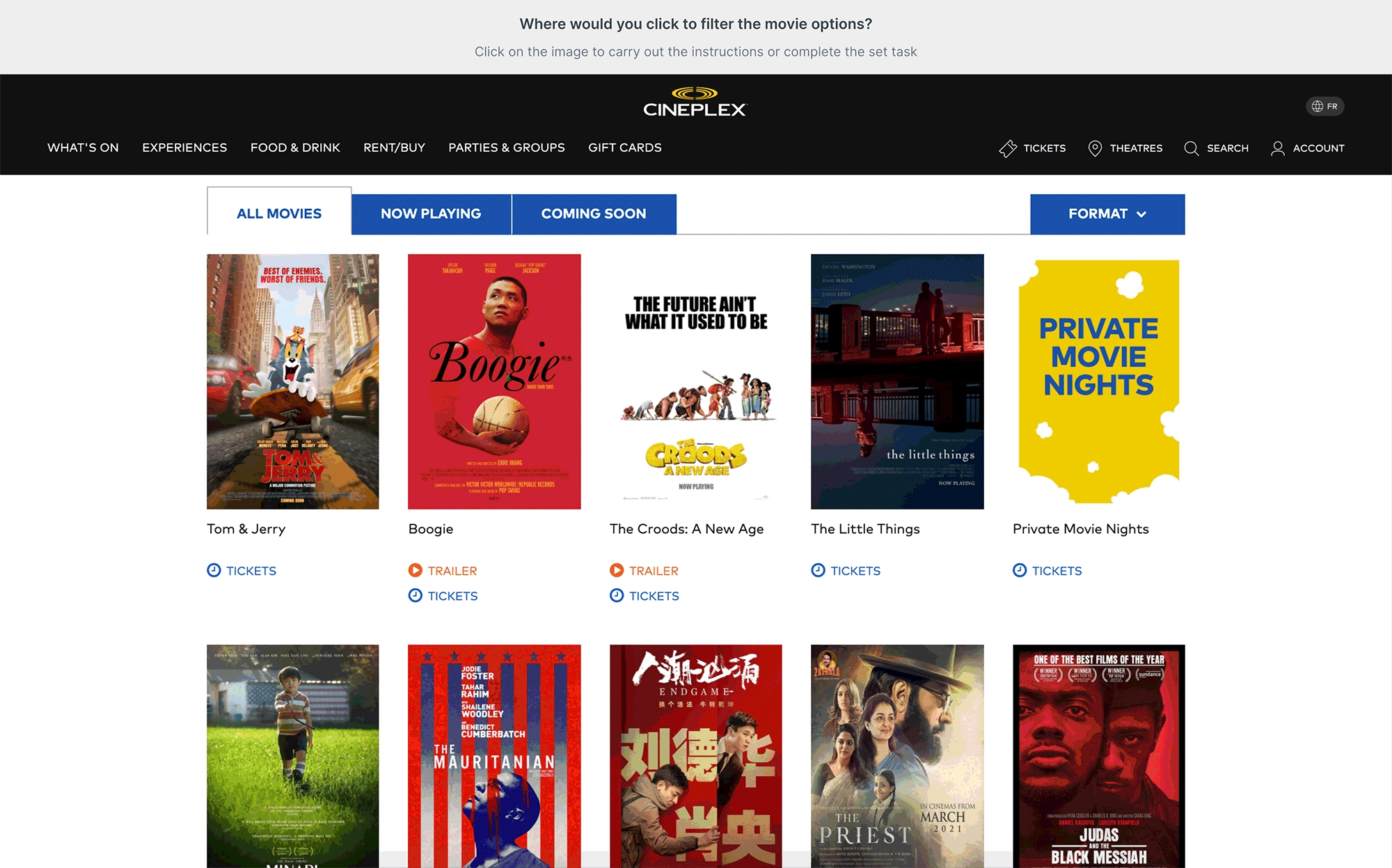
The Impact
20% task completion. Participants reported feeling fairly or rather frustrated.
Finding 3: Outdated Visual Design Undermined Trust
The homepage's cluttered layout affected user confidence, even if it didn't block tasks directly.
Store Page (80%)
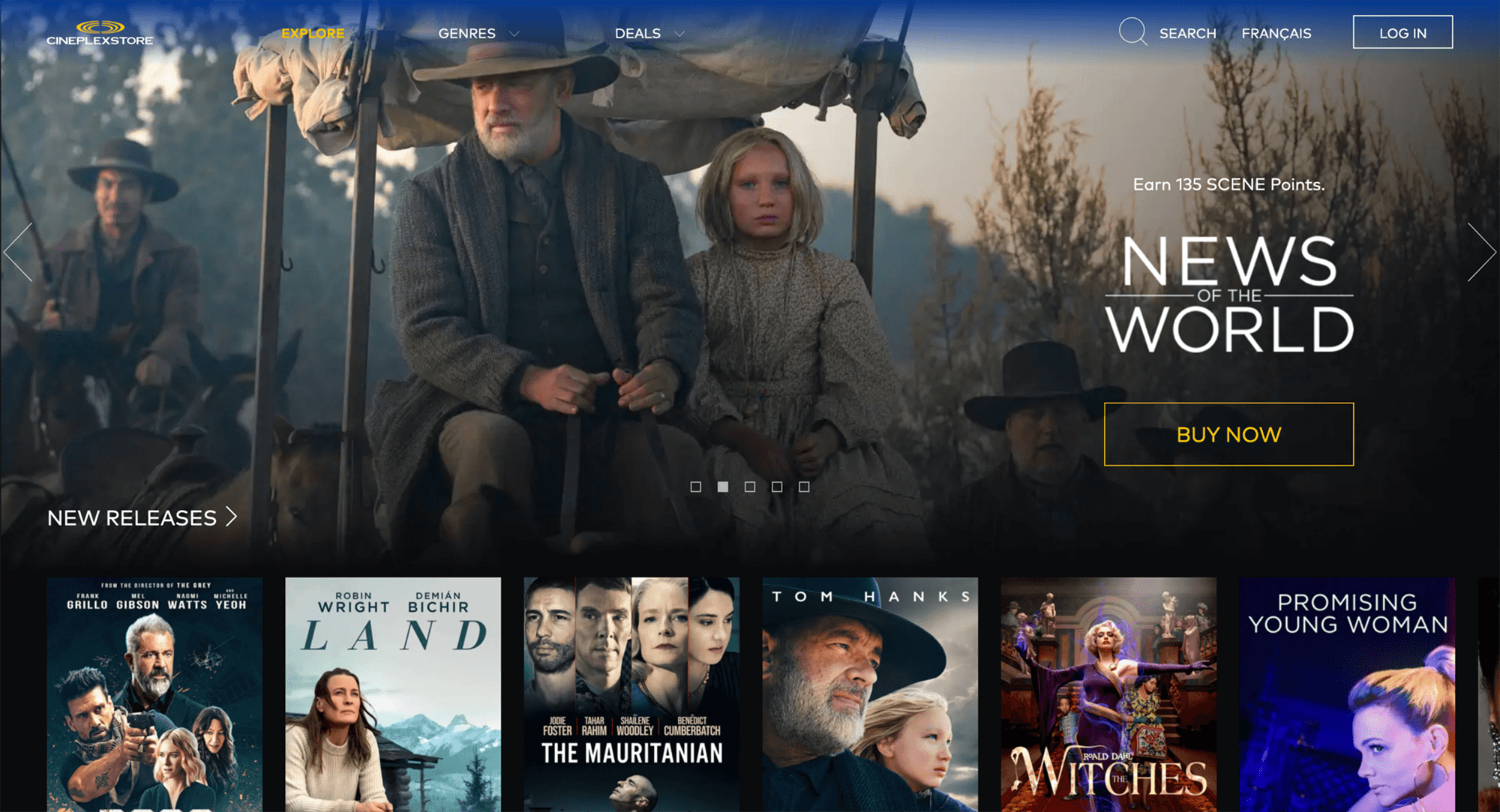
Original Homepage (20%)
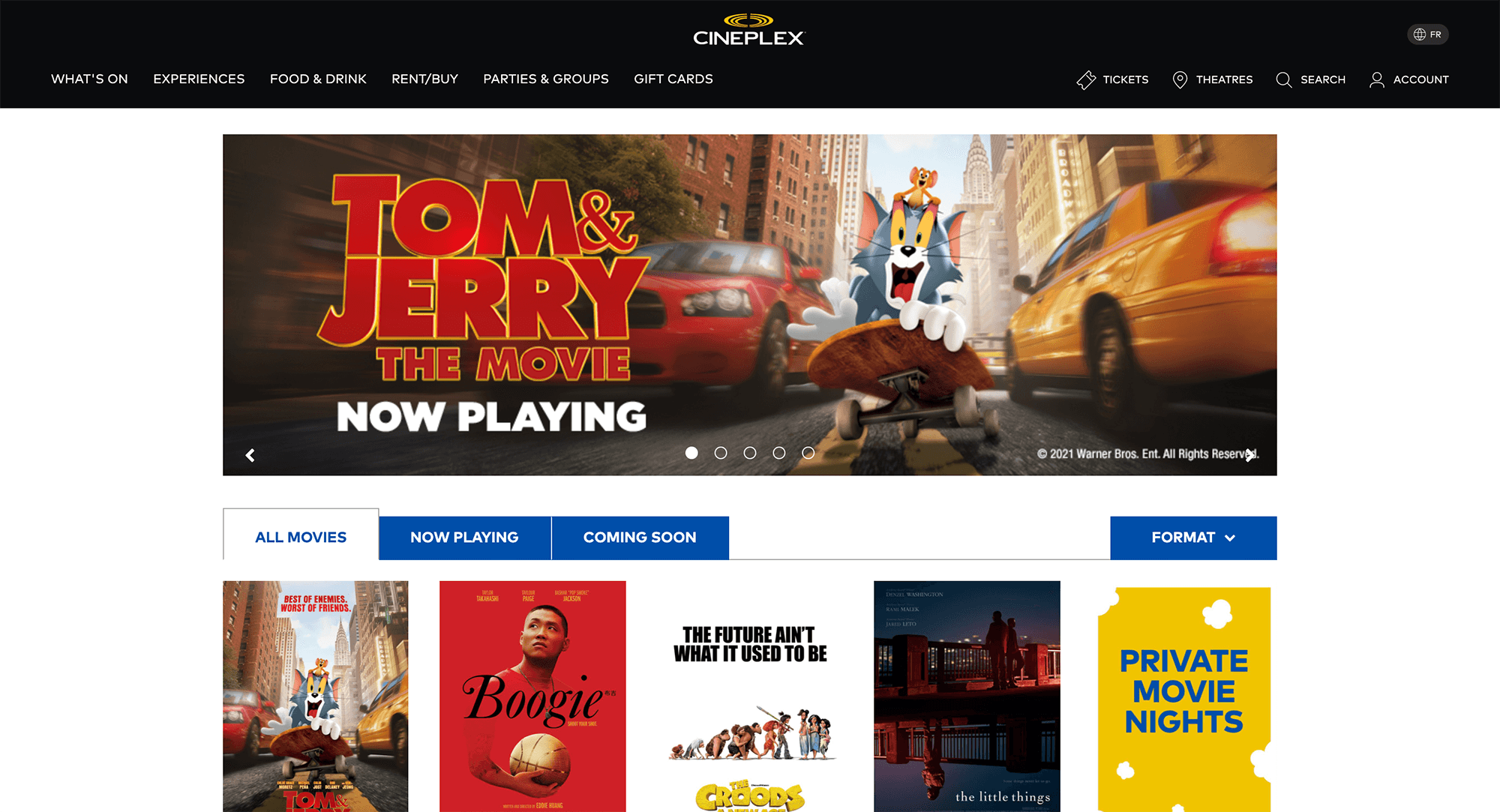
The Impact
80% of participants preferred the cleaner store page, citing visual hierarchy and professionalism.
The Numbers Tell the Story
We tracked task completion rates and time-on-task to measure usability across four critical user flows:
Participant
P1
P2
P3
P4
P5
Success Count
Completion Rates (%)
Time on Task (avgs.)
Task 1
✗
✗
✗
✗
✗
0
0%
4m 47s
Task 2
✗
✔
✔
✔
✔
4
80%
2m 12s
Task 3
✗
✔
✔
✔
✔
4
80%
1m 46s
Task 4
✗
✗
✗
✗
✔
1
20%
2m 47s
Two out of four tasks had completion rates below 50%, indicating systemic usability problems that needed immediate attention.
Addressing the Friction
Redesign Recommendations
Based on our findings, I designed targeted improvements to address the two highest-impact pain points: unclear navigation labels and missing filter functionality.
FINDING 1
0%
Task Completion
Rename "VIP" to "Dinner & A Movie" to match how users think about the feature
FINDING 2
20%
Task Completion
Surface the hidden "Refine Your Search" filter where users already expect it
Finding 3 was a perception issue, not a functional blocker — outside the scope of targeted recommendations.
Redesign 1: Rename "VIP" to "Dinner & A Movie"
The "VIP" label gave users no indication that dining reservations existed. Renaming it to match how users naturally describe the experience eliminates the ambiguity that caused a 0% task completion rate.
Before

After

Expected Impact
Renaming the label is expected to directly address the 0% completion rate by eliminating ambiguity and making the feature discoverable.
Redesign 2: Surface the Hidden Filter
The "Refine Your Search" functionality already existed — it was just buried. Moving it to the movie listing page and replacing the misleading "Format" dropdown puts filters exactly where users expect them, directly addressing the 20% completion rate on Task 4.
Before

After

Expected Impact
Replacing the "Format" dropdown with "Refine Your Search" is expected to dramatically improve Task 4's 20% completion rate. Based on first-click test results, the filter is positioned exactly where all participants clicked when searching for filtering options, providing the genre, rating, location, and viewing experience options they expected.
Reflection
What I Learned
This project taught me that the most valuable insights come from observing real users in action. No amount of heuristic evaluation could have predicted that every single participant would fail to find the dinner reservation feature—but observing it happen in real time made the problem (and solution) crystal clear.
Key Takeaways
Multi-method testing reveals different types of problems: quantitative data shows where users struggle, while think-aloud protocols reveal why
Small navigation decisions can make or break task completion
Users form expectations based on familiar patterns — designing against them creates unnecessary friction
Recommended Next Steps
Validate both redesign recommendations through A/B testing, measuring task completion rates, time on task, and satisfaction scores
Extend testing to mobile and accessibility (assistive technology)
Expand scope to additional flows: gift cards, loyalty sign-up, and account management
Disclaimer
This usability test report may contain copyrighted material the use of which has not been specifically authorized by the copyright owner. This usability test has helped me to promote my capabilities and advance my education specifically in the area relating to user experience (UX) research and includes my personal opinions, satire, criticism and review. I believe this constitutes a ‘fair use/dealing’ of any such copyrighted material.

