PROJECT OVERVIEW
Building a Brand & Website from Scratch
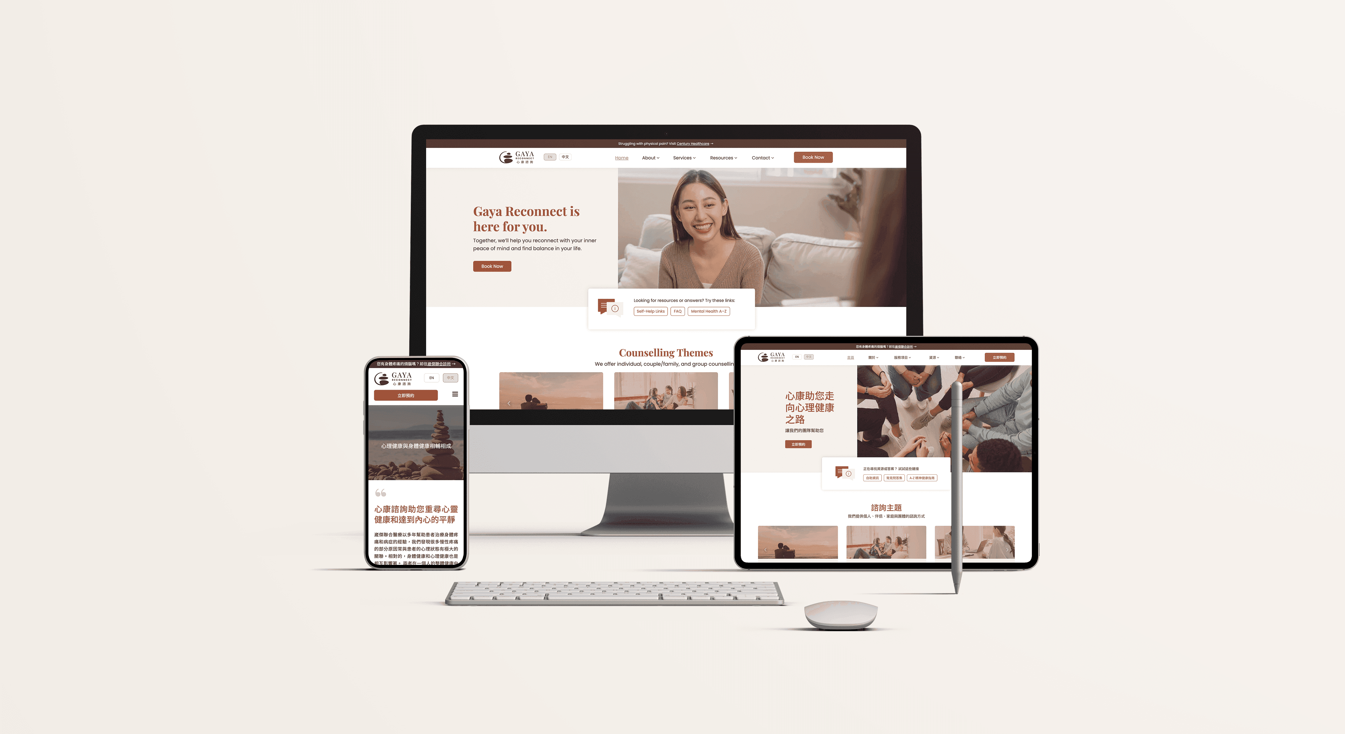
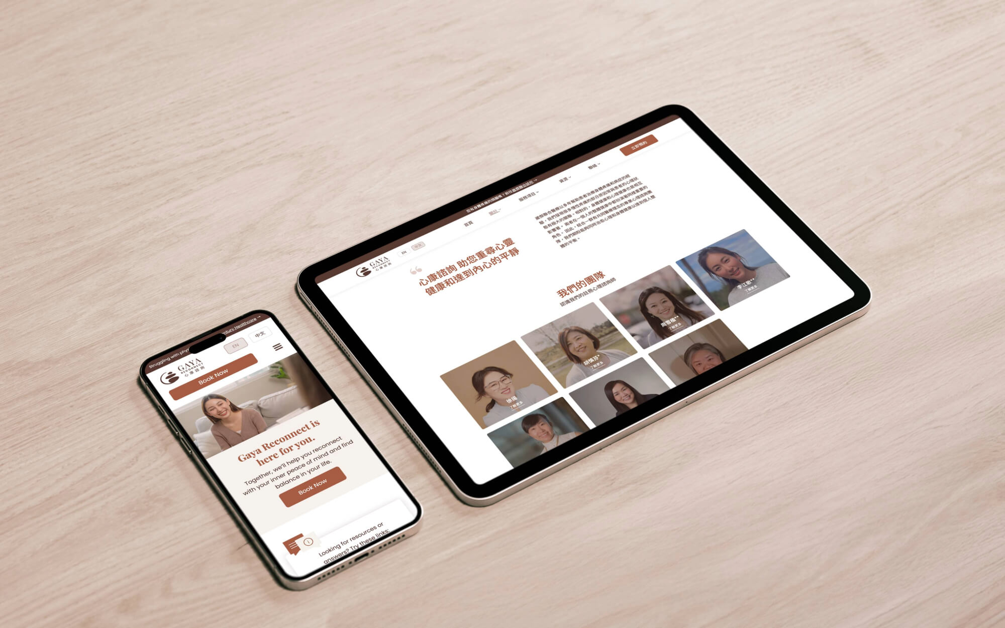
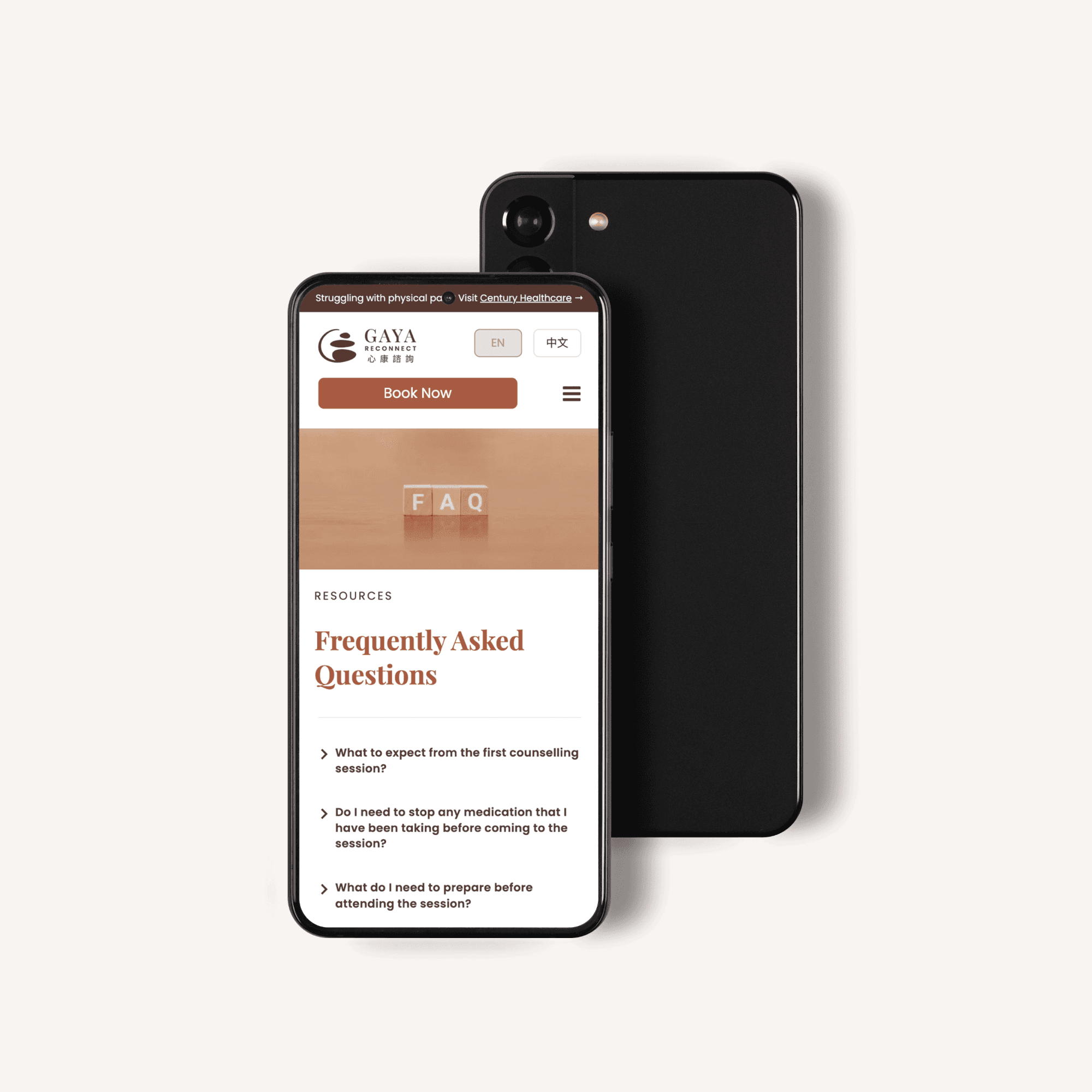
Gaya Reconnect, a mental health clinic serving the Chinese-Canadian community in BC, needed to establish their brand and digital presence from scratch. As the sole designer, I led the project end-to-end—from research and brand identity to a bilingual website for mental health services.
Live at mindhealthgaya.ca • Launched December 2022
MY ROLE
Sole Designer & Project Lead
Responsibilities
Surveyed 36 bilingual participants to uncover barriers to mental health access
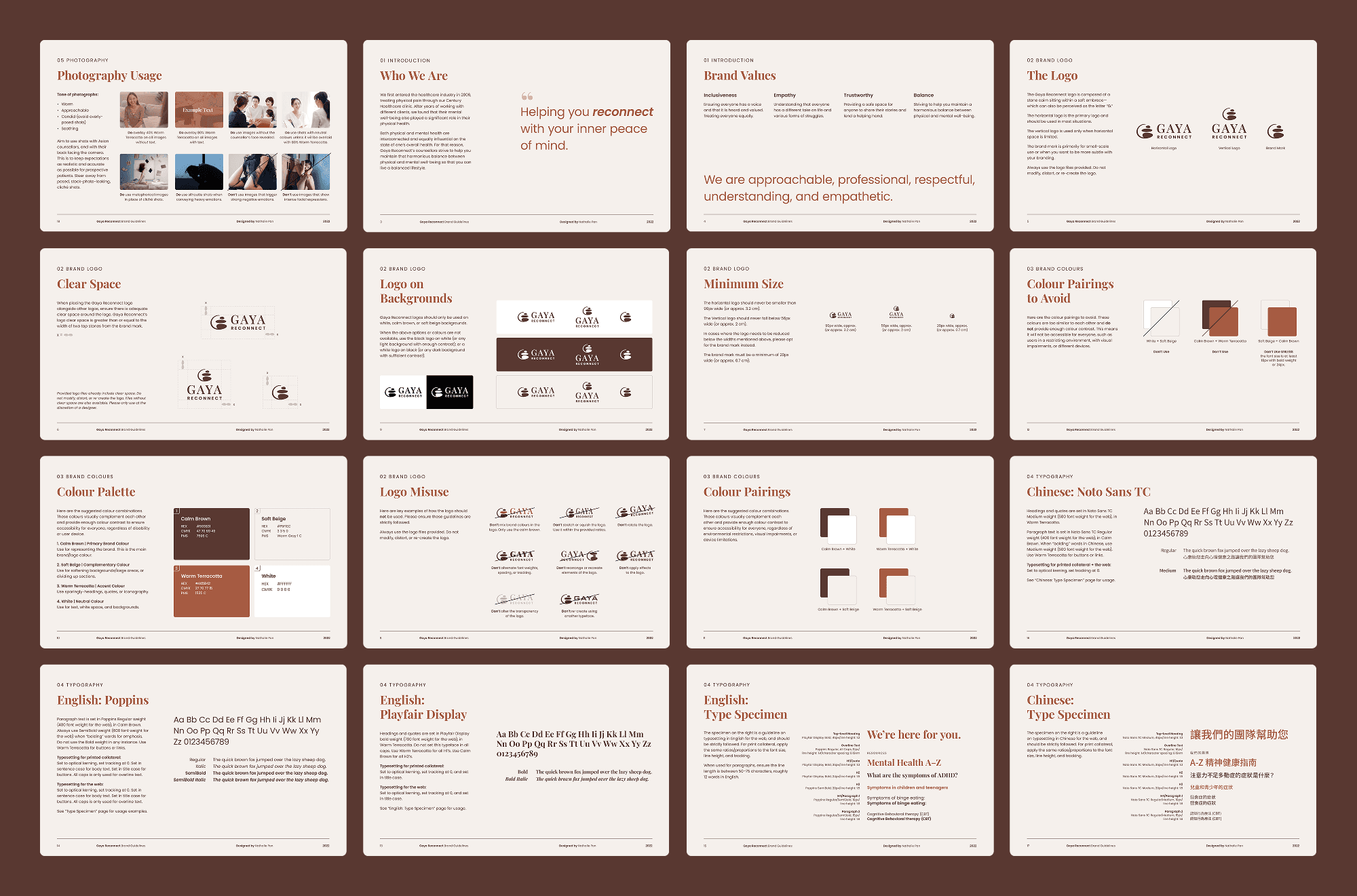
Built a complete brand identity: logo, colour system, typography, and guidelines
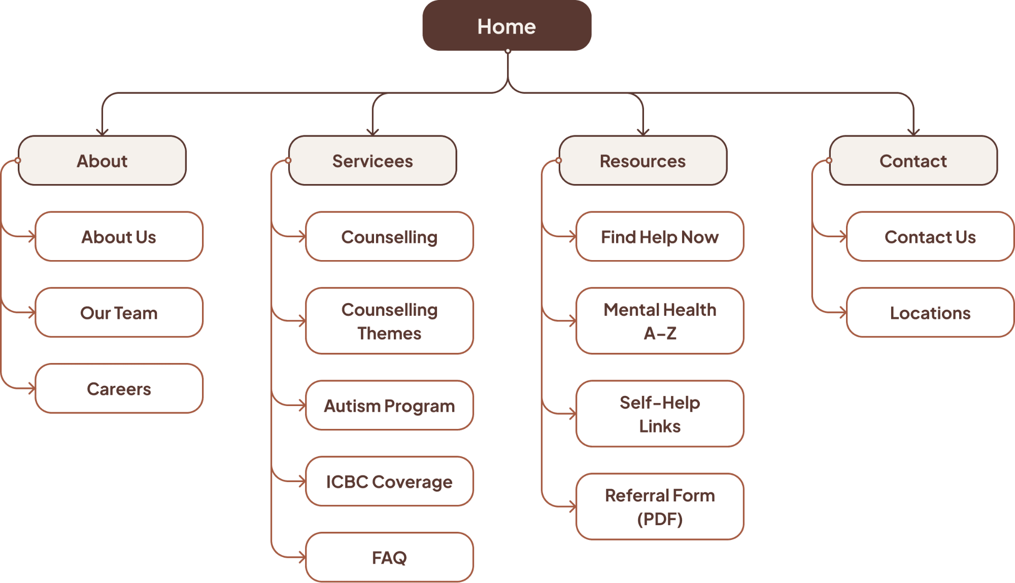
Designed information architecture and bilingual site structure
Created separate desktop and mobile layouts across 40 pages in English and Chinese
Delivered handoff documentation and a video walkthrough to maintain brand integrity post-launch
Core Solutions
Three Key Problems Solved
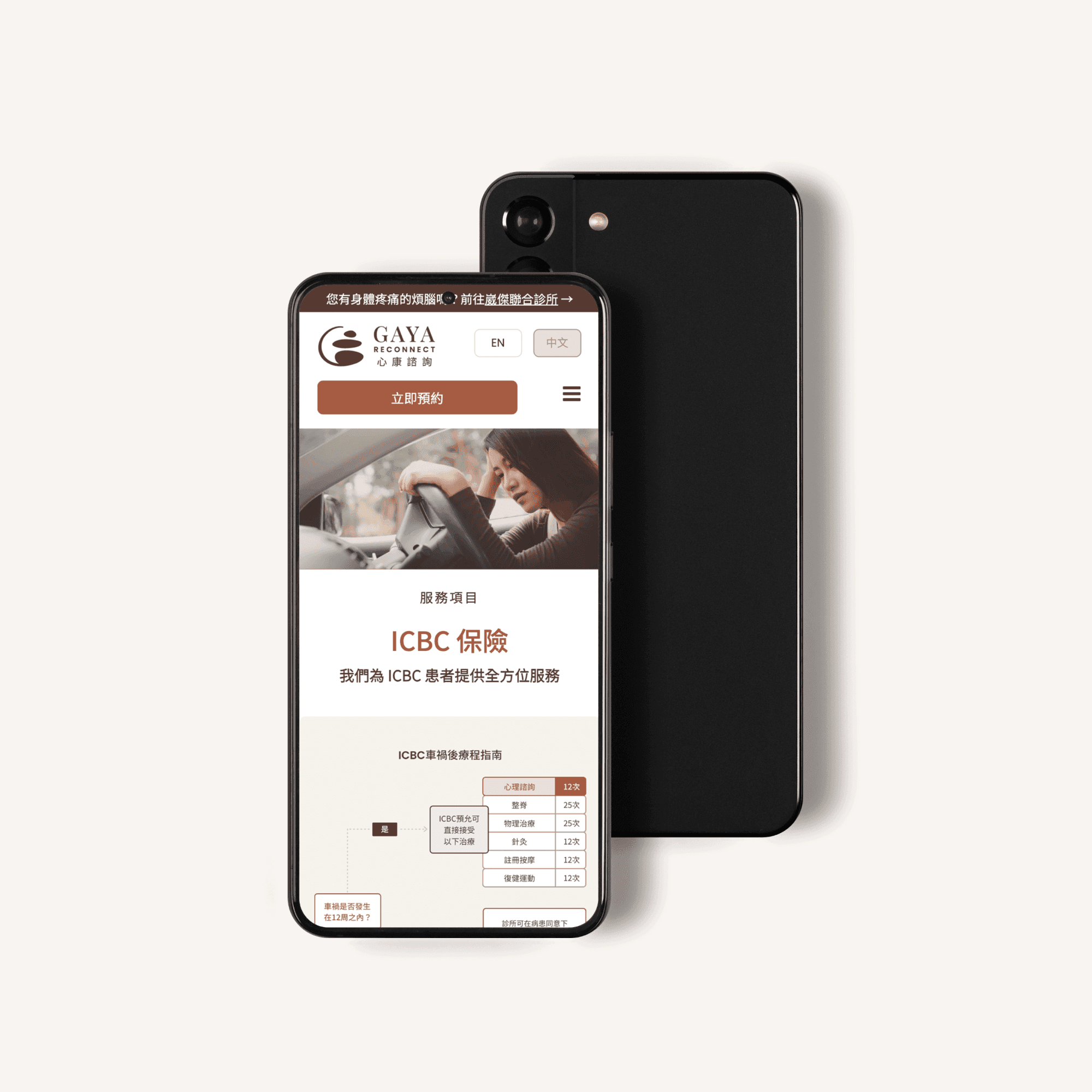
Establishing a Trusted Mental Health Brand
Challenge
Many patients were unaware the clinic also offered mental health services.
Outcome
A distinct brand identity that positions mental health as a recognized specialty.
Creating a Dedicated Bilingual Platform
Challenge
Mental health resources were nested within a general health clinic website.
Outcome
A dedicated bilingual platform with direct access to care and education.
Matching Counsellors to Cultural Needs
Challenge
Difficult to find counsellors with specific linguistic and cultural expertise.
Outcome
Detailed profiles help patients find the right match before booking.
RESEARCH & DISCOVERY
Uncovering User Needs
Research Approach
I surveyed 36 participants—bilingual (English/Mandarin) adults in Greater Vancouver—to understand how people seek mental health services and what builds trust. I also conducted task analysis and user journey mapping to identify key design opportunities.
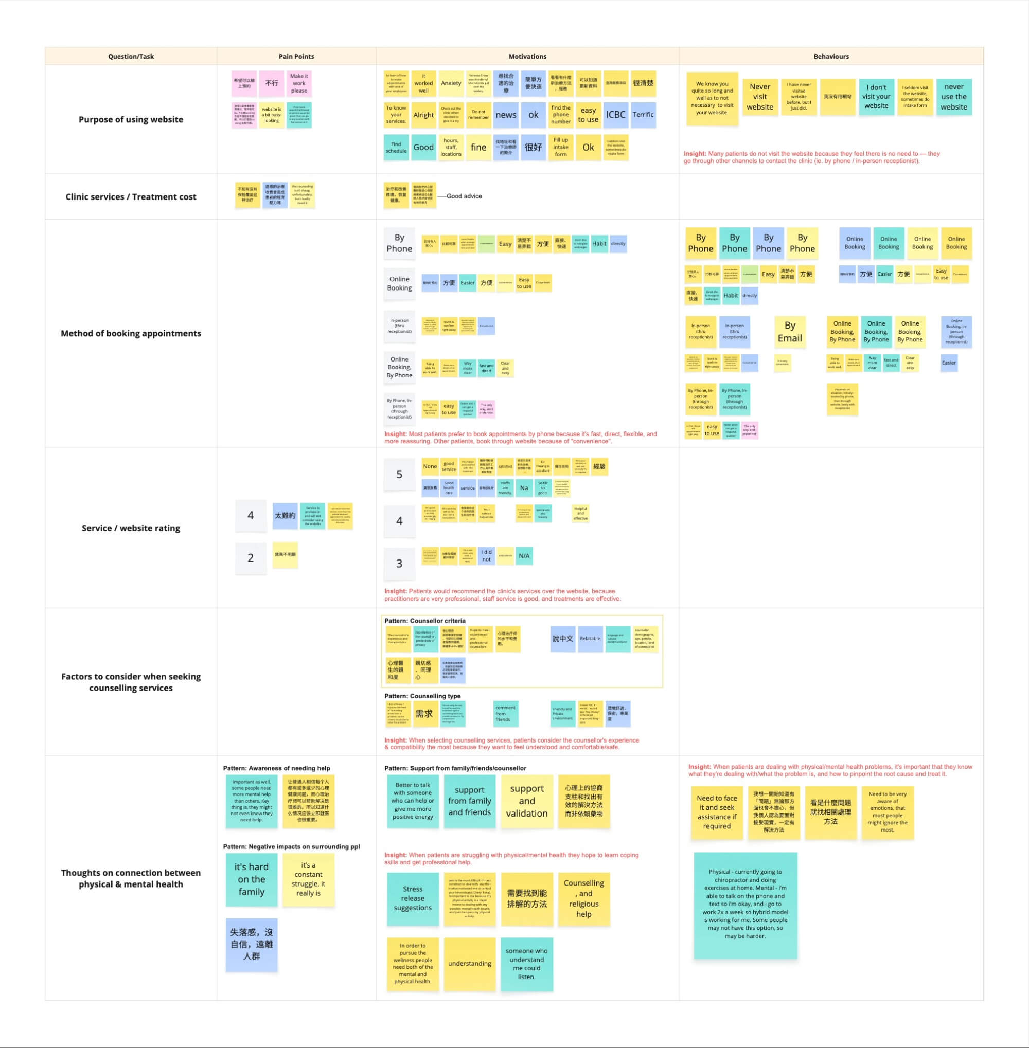
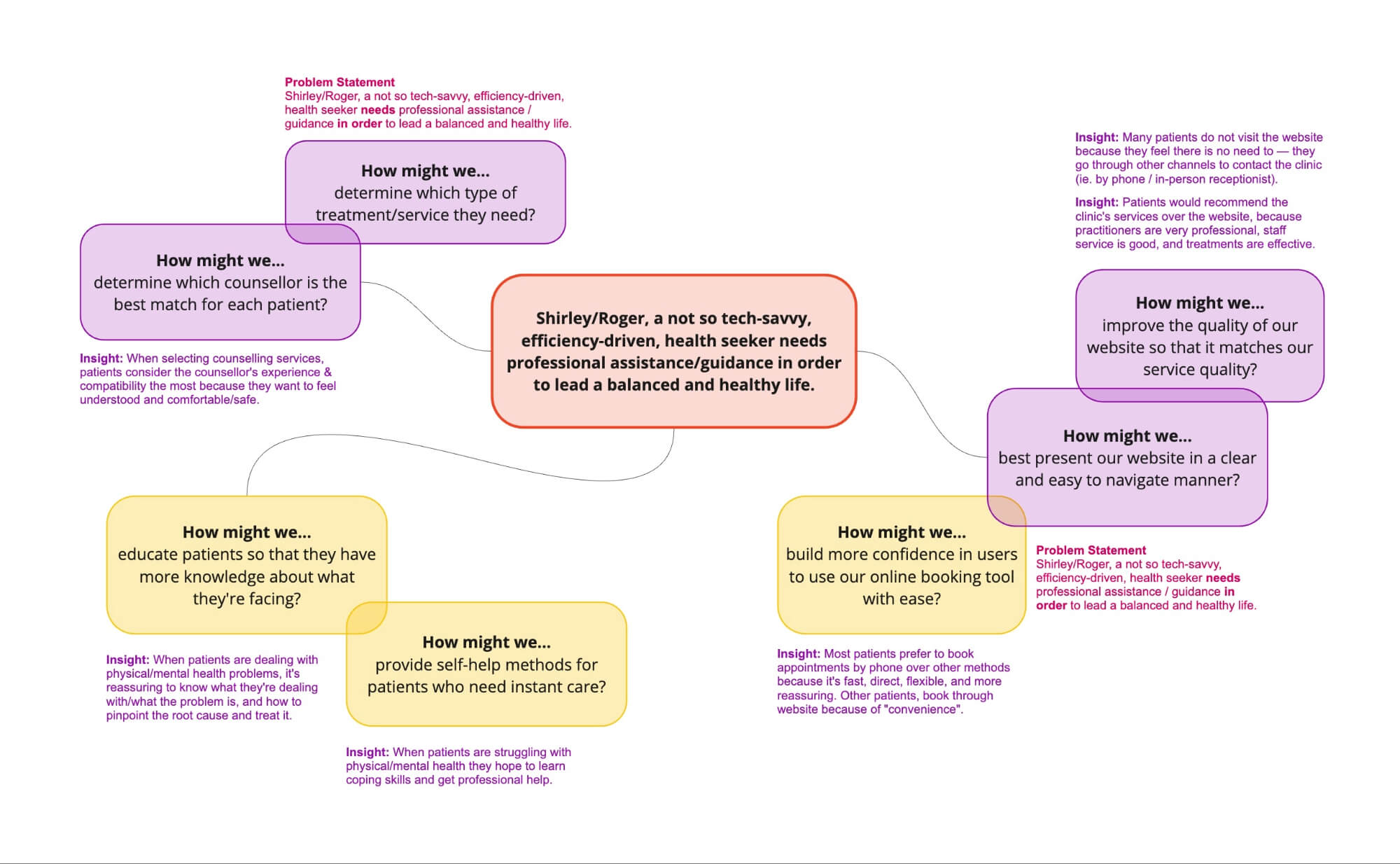
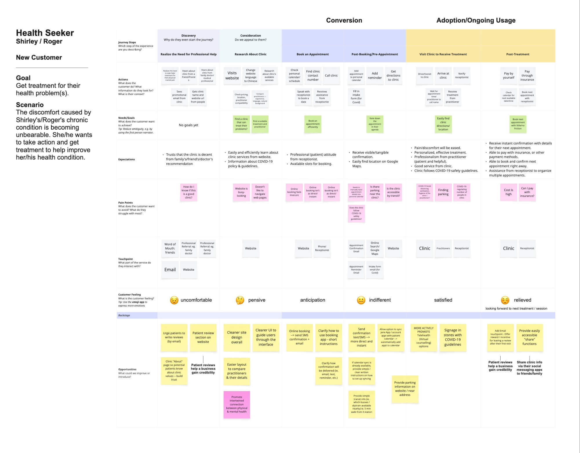
Journey mapping, research synthesis, and How Might We opportunities
Key Findings
36 Participants
Ages 55+
Bilingual (English/Mandarin)
Greater Vancouver
Counsellor Compatibility & Trust
Language and cultural background build trust. Detailed profiles are essential for verifying compatibility.
IN THEIR WORDS
"說中文" (Speaks Chinese) mentioned repeatedly
“態度誠懇認真、理解病人感受” (sincere, earnest, and understanding of the patient's feelings)
Awareness & Education Gap
Many don't recognize when they need support. Educational content helps patients identify when to seek care.
IN THEIR WORDS
"Most people might ignore [emotions]”
“所以知道什麼情況應該立即就醫也很重要” (crucial to know when to seek immediate medical attention)
User Persona
Survey respondents were predominantly 55+ (vs client's assumption of 35-45). The persona reflects bilingual adults seeking culturally compatible mental health support.
Goals
Find culturally compatible counsellor
Identify when professional support is needed
Get holistic treatment for mind and body
Pain Points
Difficulty recognizing when to seek help
Online booking and cost uncertainty
Needs simple, trusted access to services

BRAND IDENTITY
Building Trust Through Design
Brand Direction
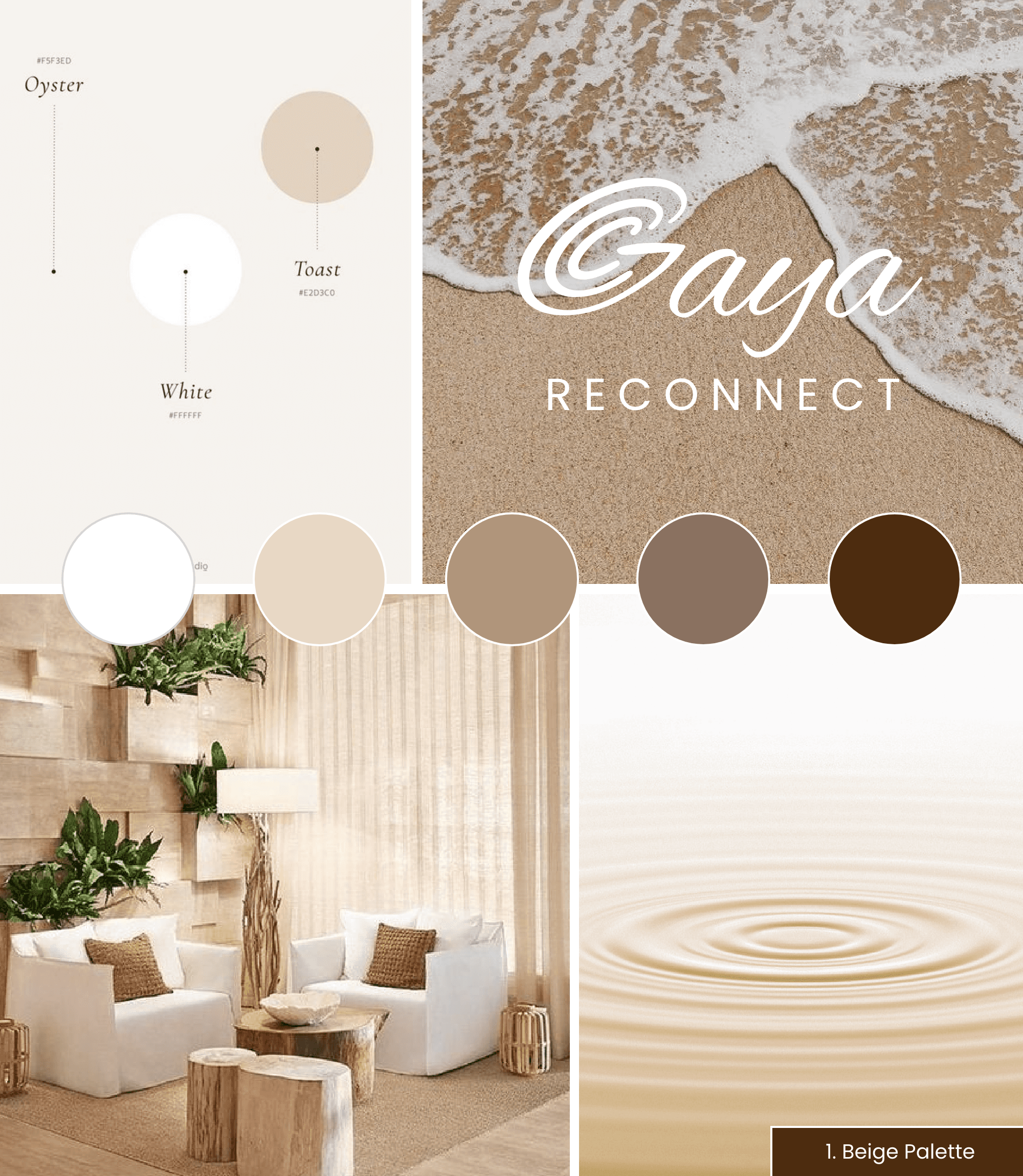
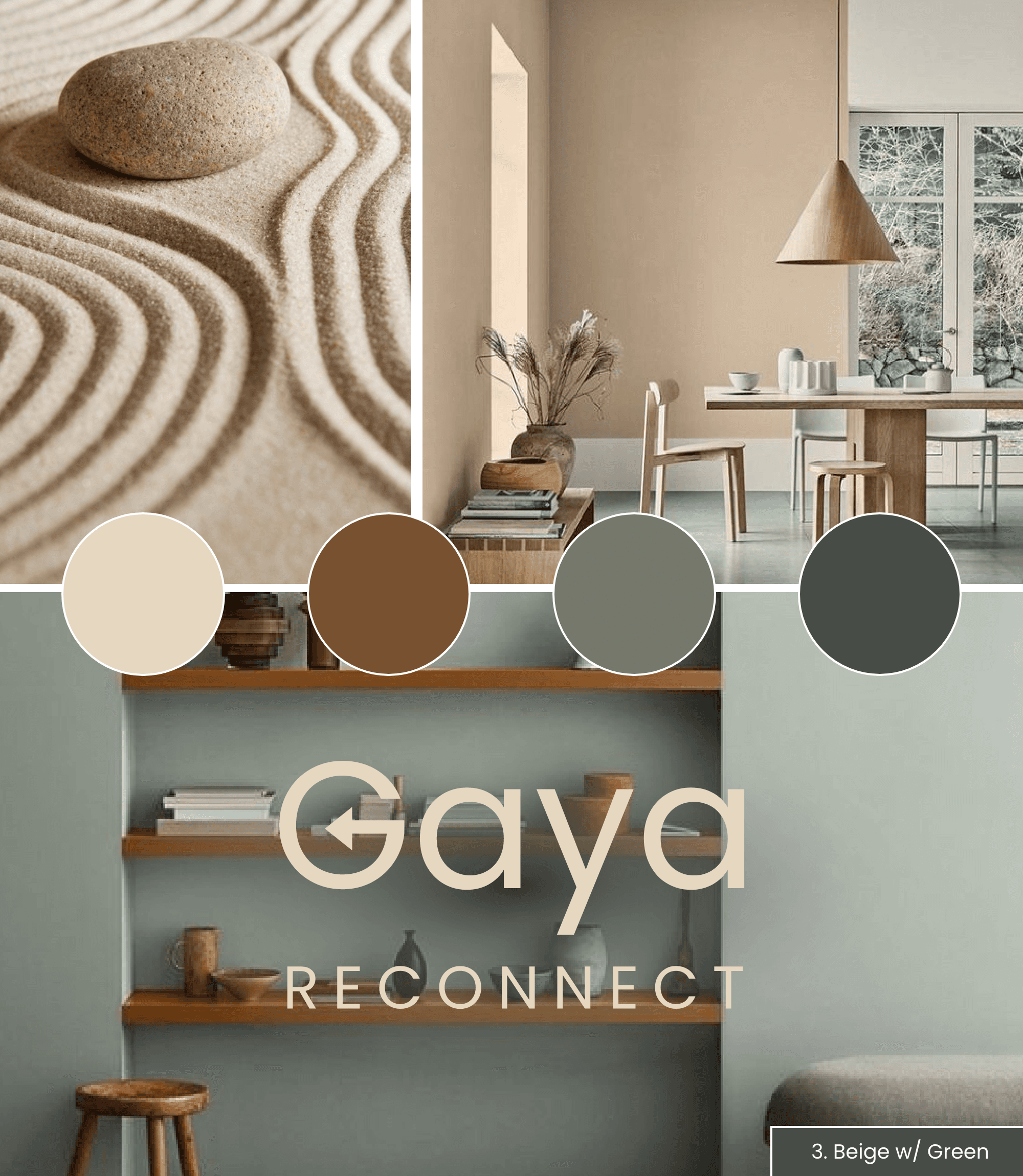
I developed three moodboard directions exploring different approaches to zen, inclusive, empathetic, and warm positioning. Through stakeholder discussions, we synthesized elements from each direction to create the final brand identity.

Visual Identity
The final identity combined warm tones and organic forms from the moodboard exploration, designed to balance approachability with professionalism:
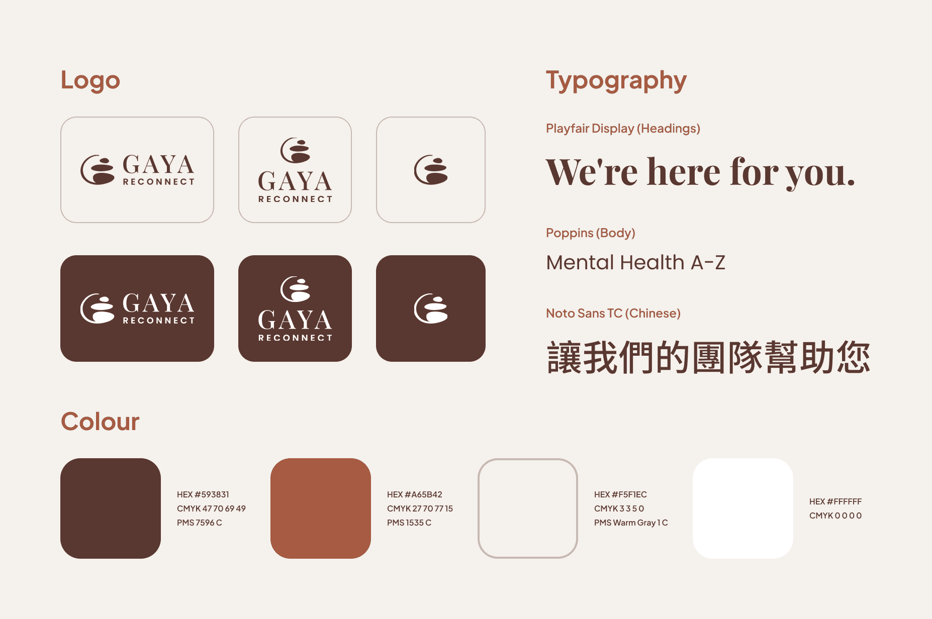
Logo: Balancing stones representing zen, balance, and harmony—core to the clinic's holistic approach
Colour Palette: Warm colours conveying trust and calmness, all meeting WCAG contrast standards
Typography:
Poppins: Friendly sans-serif for approachability and accessibility
Playfair Display: Balanced serif conveying professionalism
Noto Sans TC: Optimized for Chinese character legibility
Brand Guidelines
I created comprehensive brand guidelines covering logo usage, colour applications, and typography hierarchy—designed for non-designers on the client's team to maintain brand integrity after handoff.
Website Design
Designing the Bilingual Platform
Information Architecture
I structured the site to accommodate 40 pages per language while maintaining consistent navigation and information hierarchy across both English and Chinese versions.
Site structure: Home, About, Services, Resources (Mental Health A-Z, help lines, community support), Events, and Contact—40 pages per language.
Bilingual Design
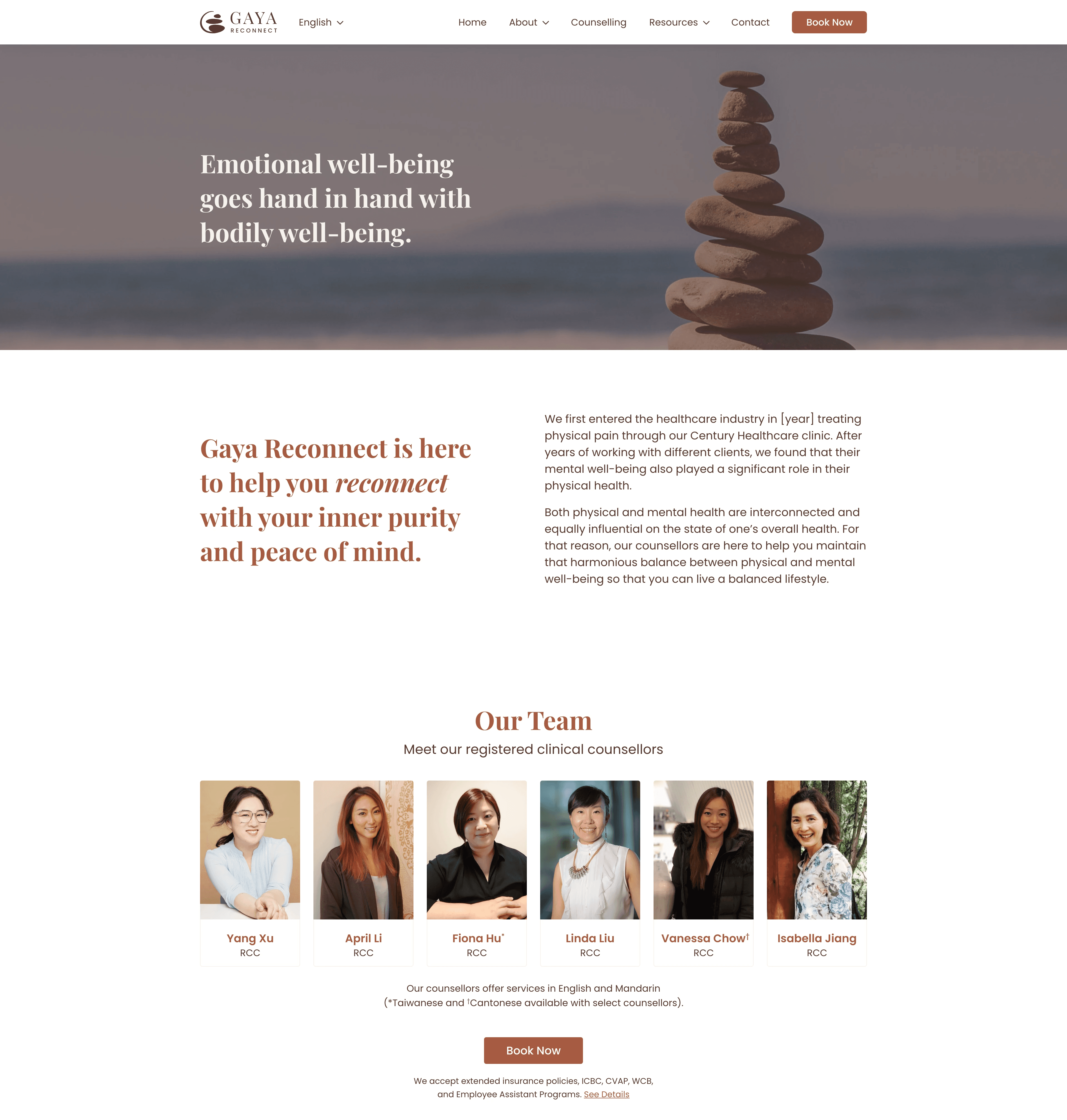
All 40 pages were designed in both English and Chinese, requiring flexible layouts to accommodate different text lengths and cultural contexts while maintaining equivalent user experiences.
Counselling Page
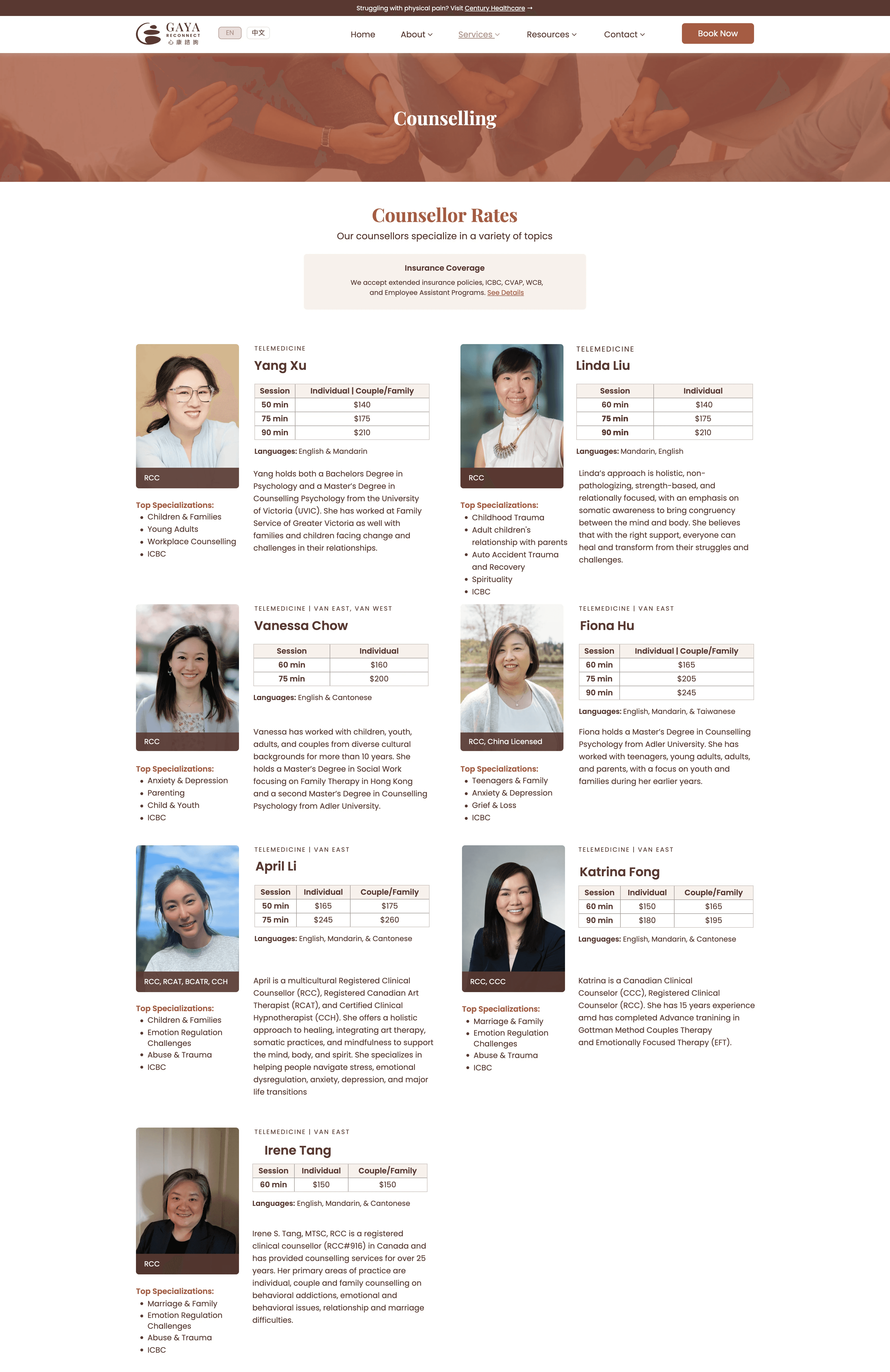
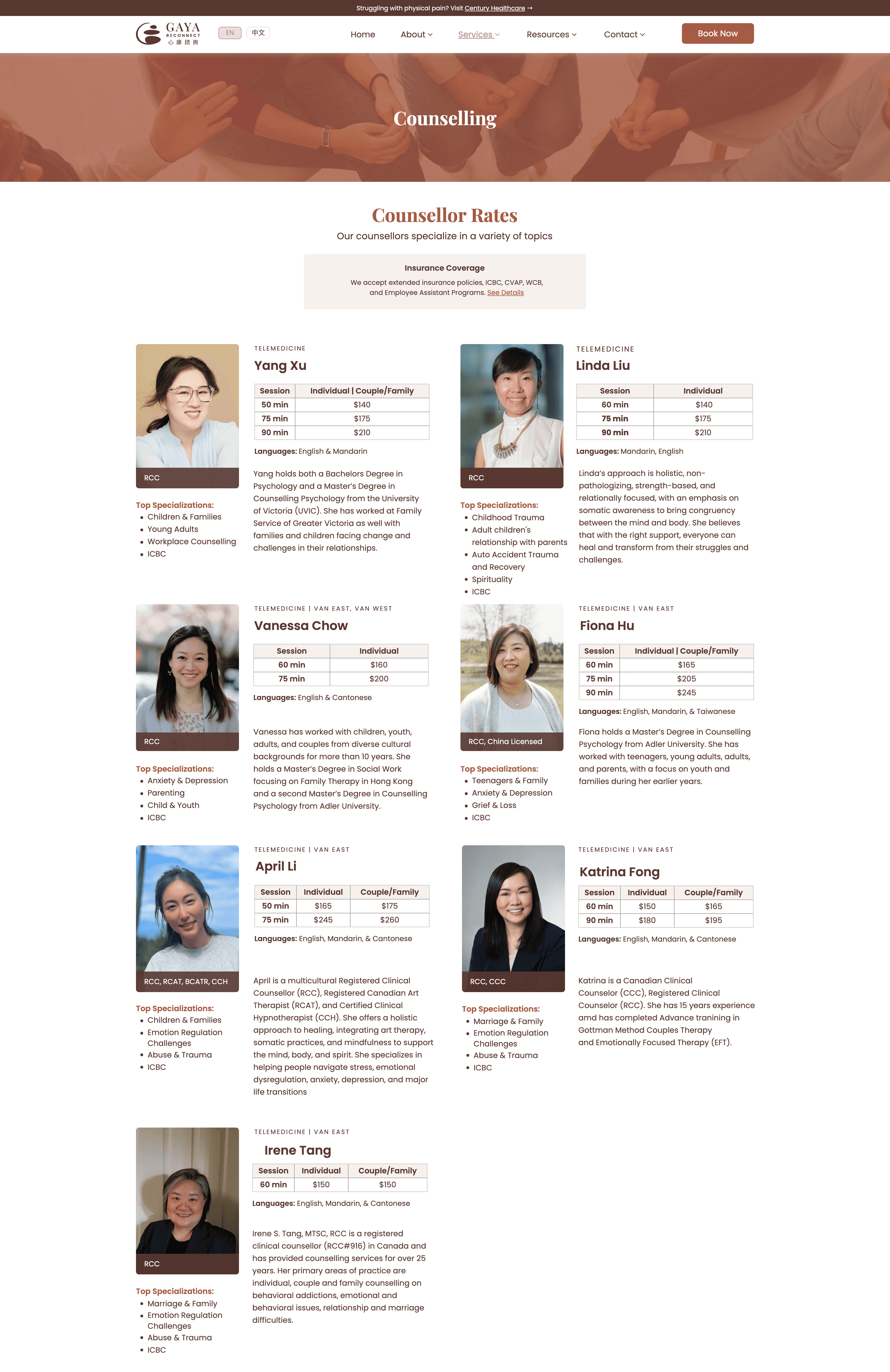
Wireframes to High-Fidelity
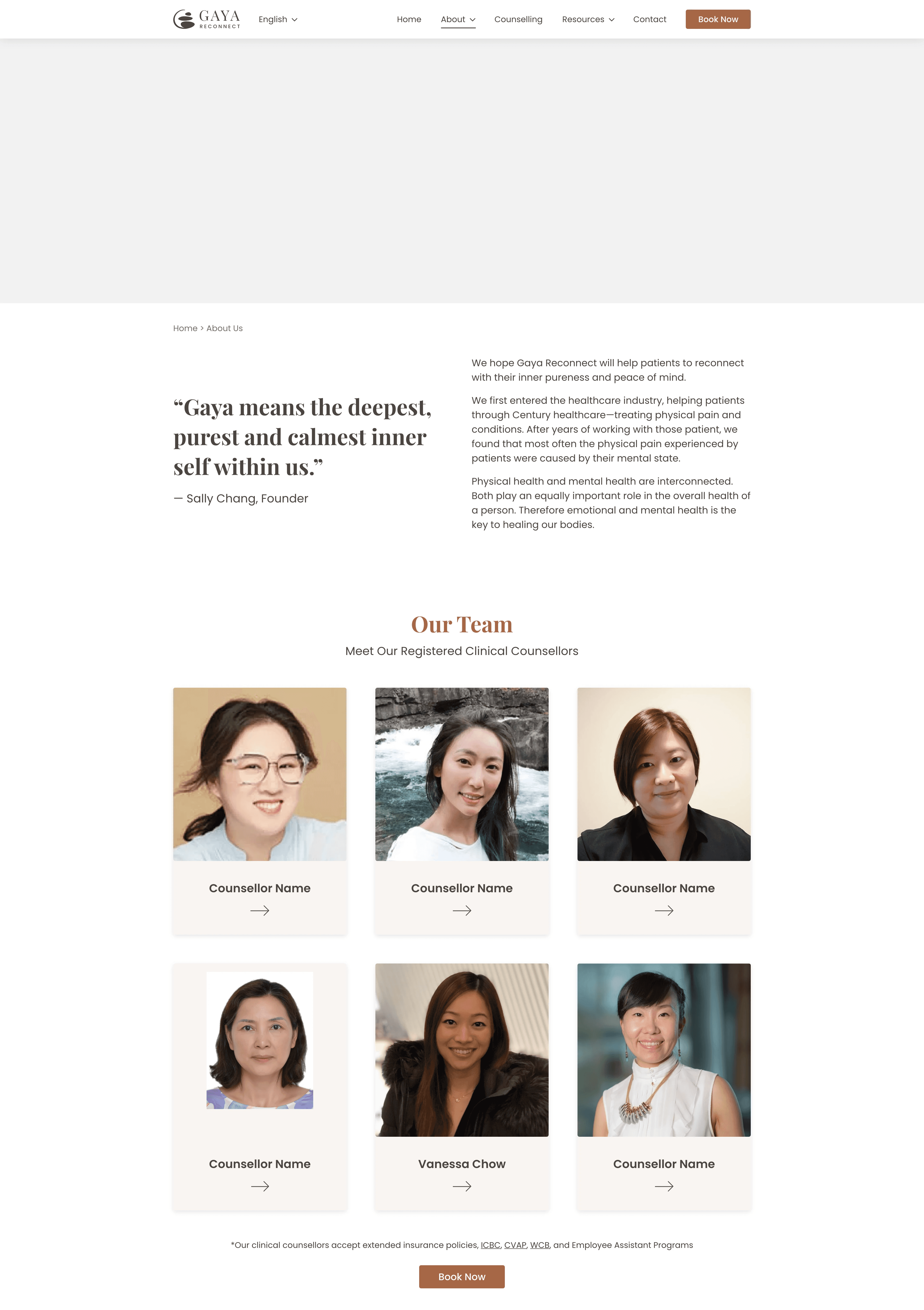
About Us Page
Wireframe (Lo-Fi)
Mockup (Hi-Fi)
IMPLEMENTATION
Building & Launching the Platform
Website Development
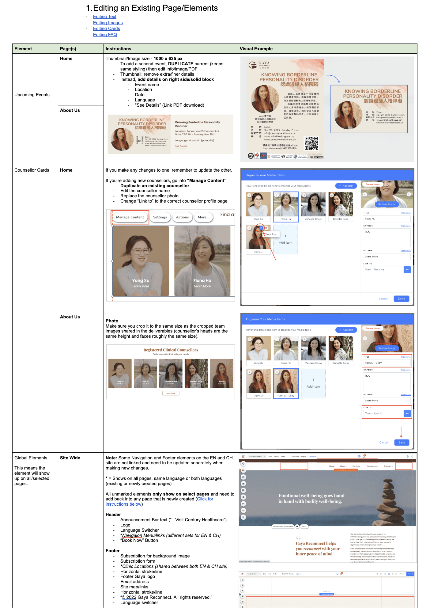
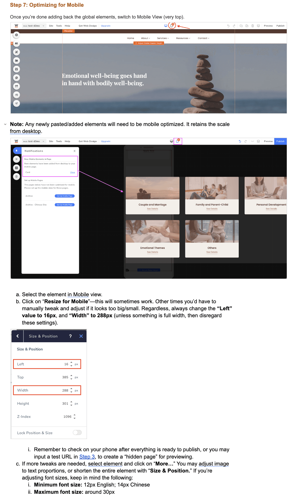
Built 80 bilingual pages (40 per language) with separate desktop and mobile layouts.
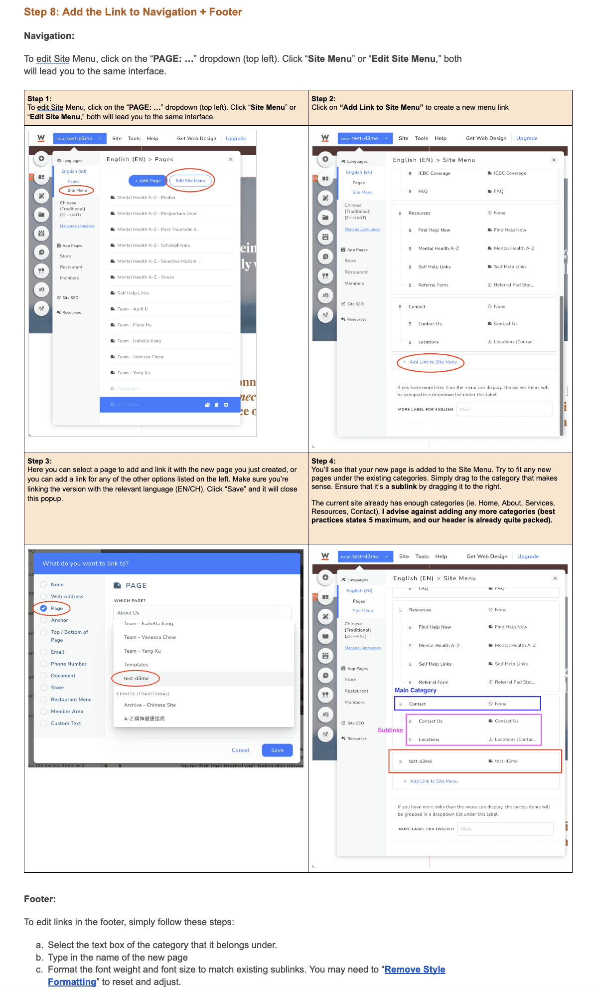
Handoff & Documentation
I created comprehensive handoff documentation including brand guidelines, platform tutorials, content templates, and a video walkthrough—enabling the client's team to maintain the site independently.
Reflection
What I Learned
This was my first end-to-end UX project, teaching me valuable lessons about solo project management and client collaboration.
Key Takeaways
Clear timelines and regular check-ins maintain momentum while allowing flexibility for client feedback and content gathering
Gathering comprehensive content early ensures efficient use of time and reduces delays
Creating documentation for non-designers requires explaining both the "what" and "why" of maintaining systems
Areas to Explore
Investigate why the target demographic (ages 35-45) engages less than the 55+ age group
Conduct usability testing with actual patients to validate navigation and content findability